
The purpose of the campaign was to spark a conversation about messaging again with clients from Enterprise, SaaS, and B2B businesses.
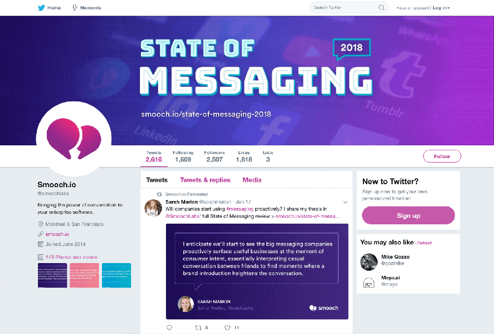
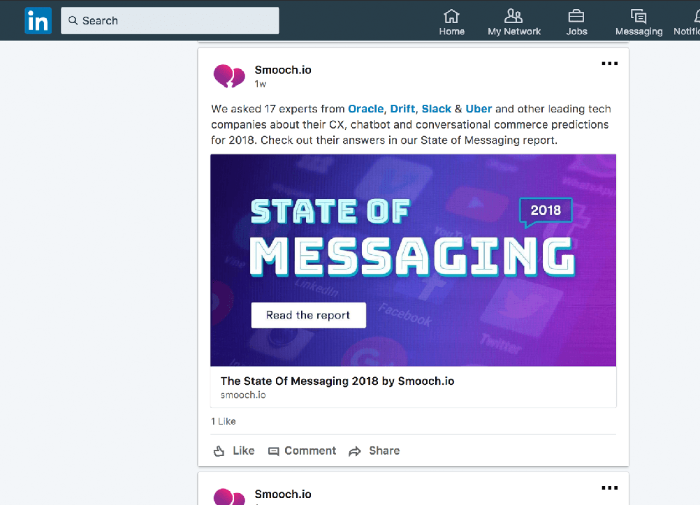
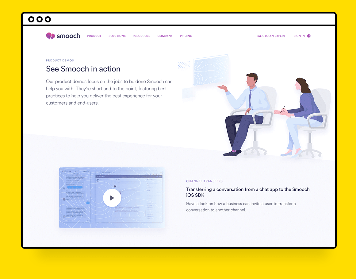
My job duties were to design a one-page website to be sent out by the sales team and create banners promoting the website on Linkedin and Twitter. With a tight deadline to design, I didn't have time to illustrate supporting assets that were usually seen in the Smooch brand so I experimented with typography, color, and patterns. After a few days live new clients contacted sales wanting to learn how Smooch can improve their messaging needs.
Process work
Wireframe
I got a rough first draft of the copy to create a wireframe. This wireframe helped guide the length of the content and what elements can be repeated for quick development. It was shared with the team to set our goals and plan development.
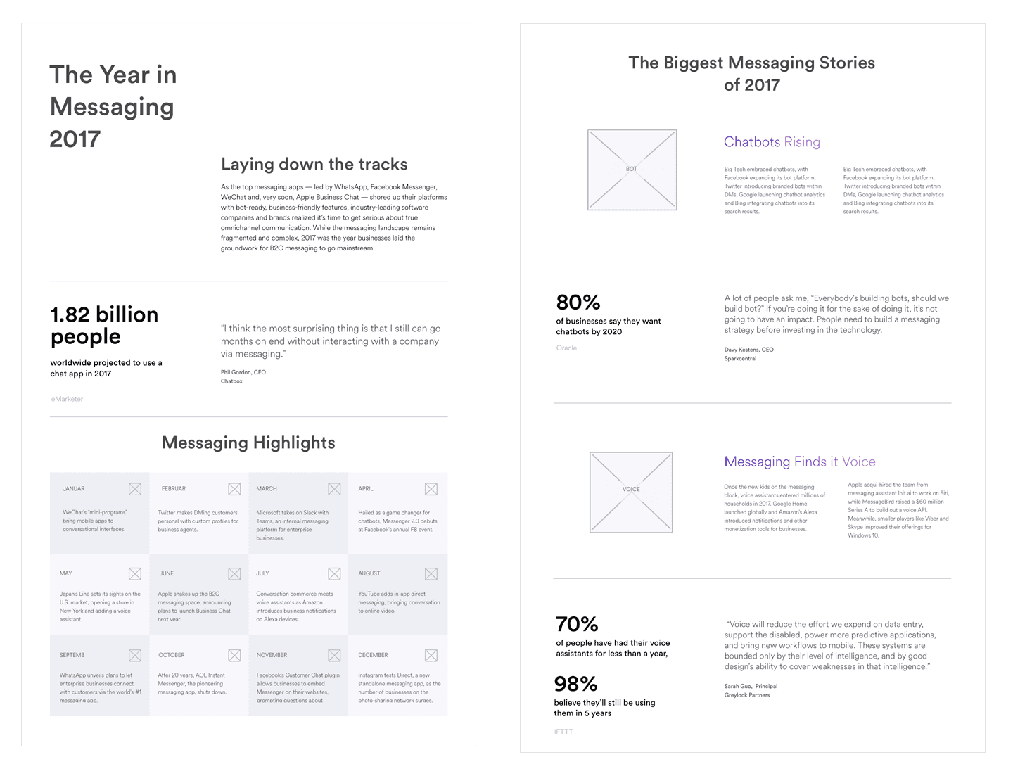
Layout rough
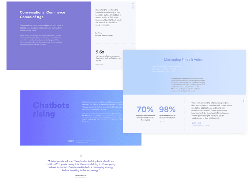
With a short design timeline I decided to focus on color and typography with minimal photography. In the first design, the quotes were going to have their own section block but there was too much empty space and it broke up the reading flow. A redesign of small floating modules for the quotes were made.
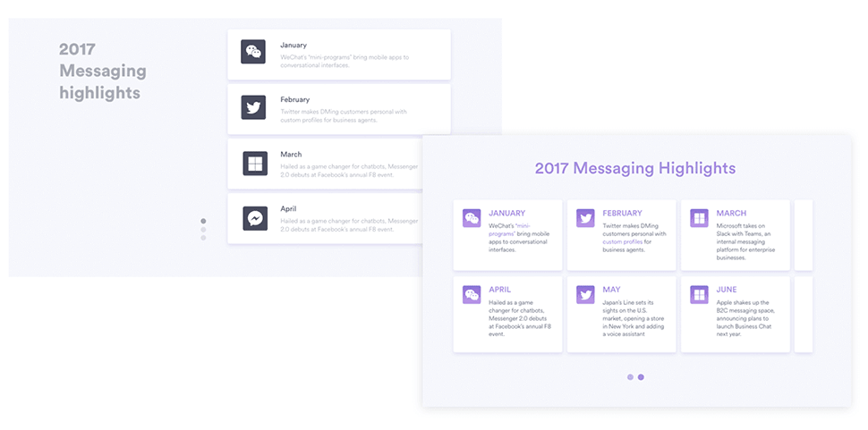
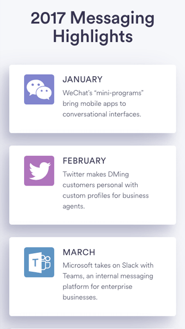
Timeline UI exploration
A quick exploration of the timeline layout and icon treatment.
Final Work
Web page


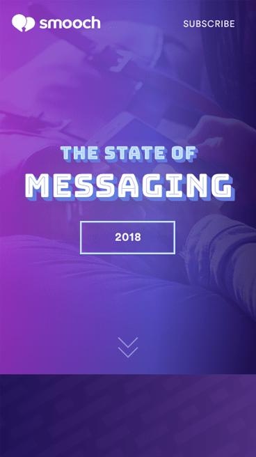
Mobile

Social media banners
