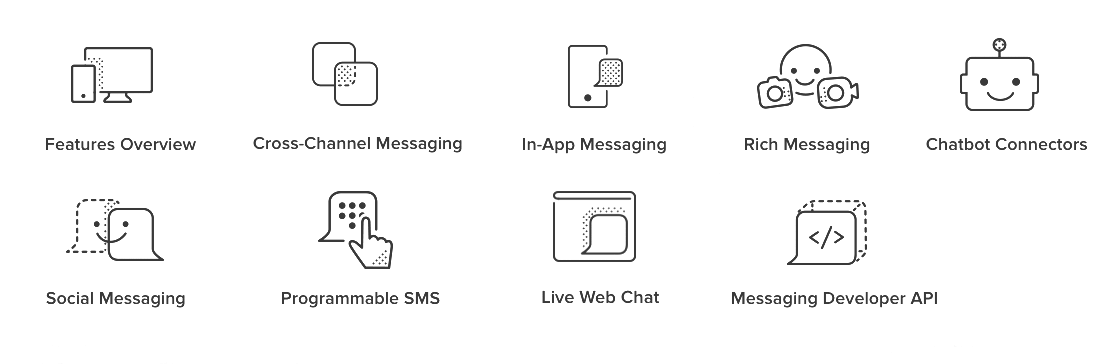
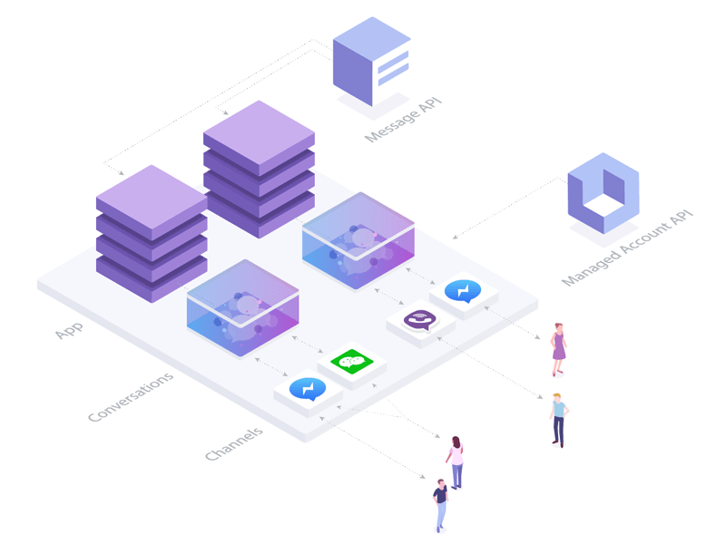
Smooch is the omnichannel conversation platform for software makers. Through a suite of developer-focused tools, SDKs, and APIs, Smooch enables you to bring the power of modern messaging to your enterprise products.
When I first started working at Smooch, I was able to use my illustration skills to add custom illustrations to different elements of the brand. Some projects include the website, web app, social media and blog banners, and conference swag.
client
Smooch
date
2016
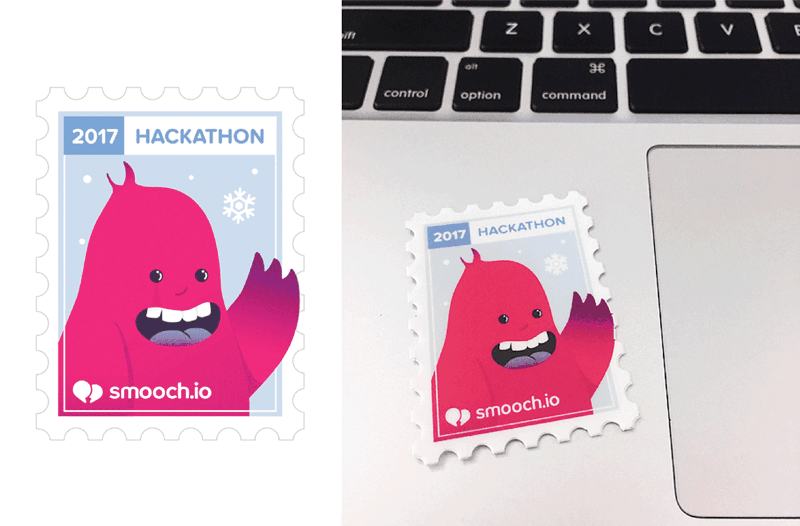
Hackathon sticker
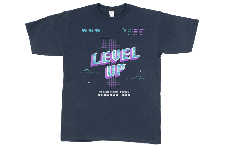
One year anniversary t-shirt
Evolution
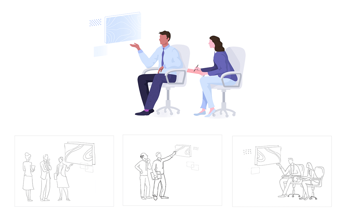
The design team worked together and evolved the Smooch brand to the next level. Smooch was now targeting Enterprise and Saas companies and needed to trade our bubble gum colors for a toned-down professional style while feeling fun and exciting.
Part of the new design direction was to have the illustrations in a business setting with people. My job was to illustrate the images and icons for the new website, web app, social media banners, and blog from ideation to the final design.
date
2017
New color palette
We kept the Smooch colors: purple, pink, and blue. It went from a vibrant color scheme to a softer pastel.
#373253
#8060bd
#dc9ed7
#b0c2f9
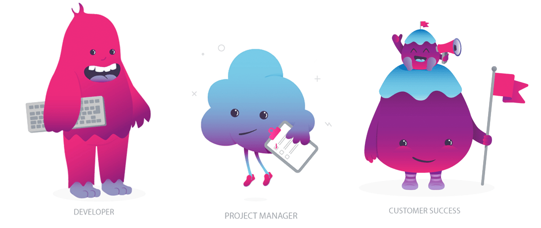
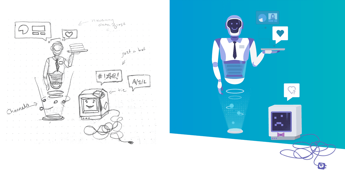
People
Here are a few characters introduced to the Smooch brand. They were responsive in scale depending on the illustration sizes. You may notice that some of the characters have faces and some don't.

Detail
Characters with facial detail were used in large spot illustrations. They were the only character in a concept.
Face/OFF
Characters with no faces were used as supporting elements and scaled small. For faster recognition, the facial features were removed. The reason for this was because details of the face were difficult to decipher at a small scale, and made the illustration look cluttered.
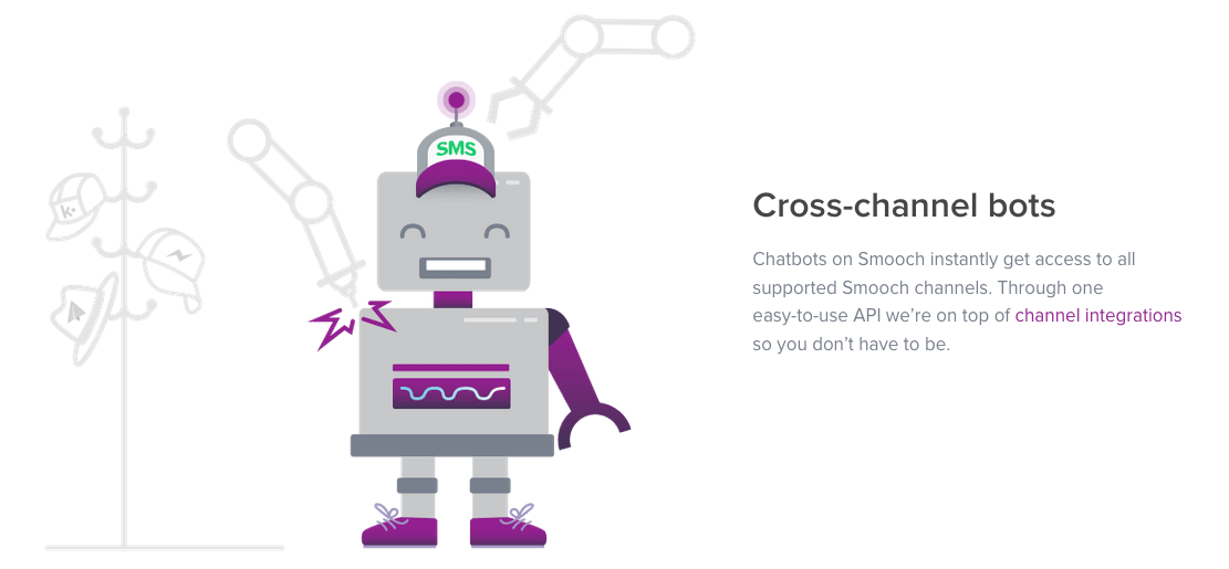
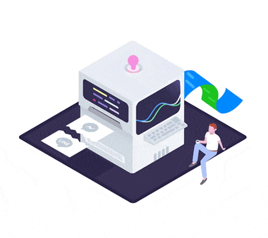
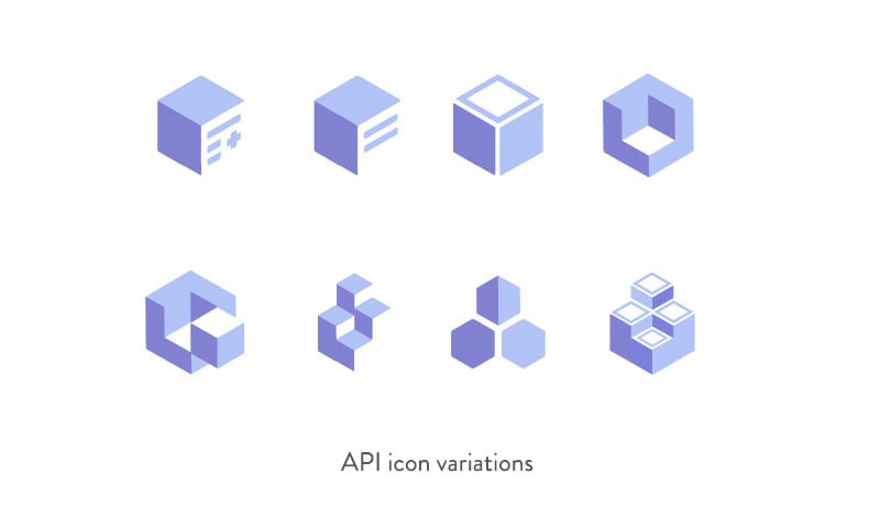
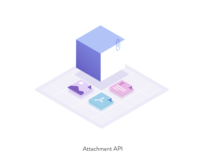
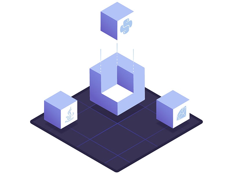
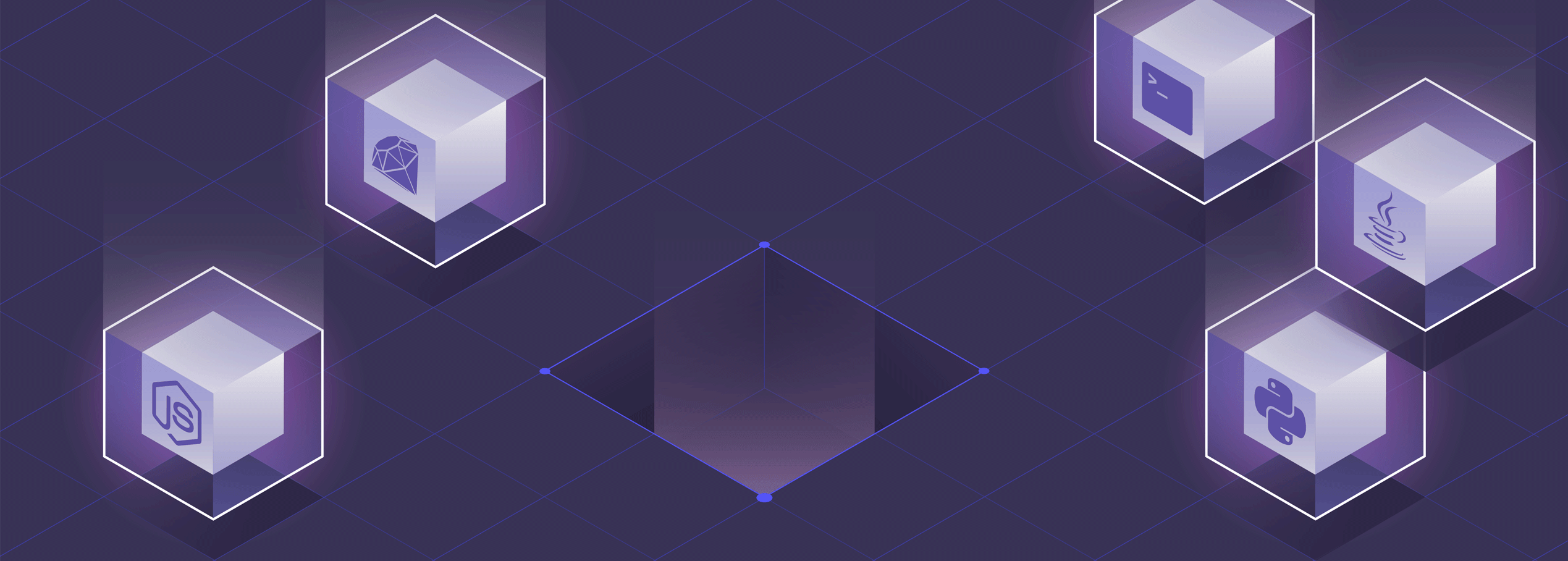
Creating an API icon
A rebrand meant a new website design with new icons. The focus was on showcasing Smooch's development tools such as the API. In my research, I found there was no common imagery for an API icon. The icon results varied from either web browsers, puzzle pieces, gears, and plugs. They didn't fit with the complexity of Smooch's API. Some of Smooch's API features included export data, attach images, accounts, languages, messages, all on mobile and web.

What API do? ¯\_(ツ)_/¯
To get a better understanding of what an API is, I asked a developer to break it down to me as though I were his grandma. Like all technological explanations to grandma, it involved a few meetings, a diagram, and a silent prayer to Jesus for strength. I left with a basic understanding that an API is a magic block of information that developers can request data from to help build their apps. In other words, they tap into the Matrix.
Icon Formula
Smooch was an early adopter of the isometric style. Going with a 3D look, I sketched out a few ideas using 3D blocks and an icon of a page with information.
Here is the formula that became the Smooch API icon:
Blocks + 3D = Lego brick
Lego brick - knobs + information = API
Website header illustrations
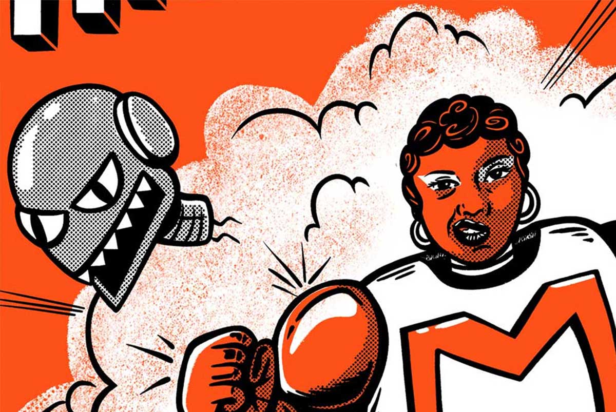
Ch-ch-ch-ch-changes!
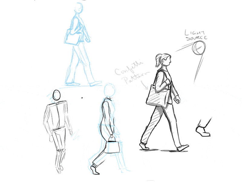
The new style includes the use of textures, patterns, and a 2D perspective to show dynamic poses. The new illustration style includes business situations and people in office business attire.
date
2018
Growing color palette
After I designed The State of Messaging website, the lead designer and I thought the teal and orange-pink colors from that project looked nice as tertiary colors. They were added to the brand color palette and used as background colors in the website banners.
#009ad4
#00b2c2
#fb98a3

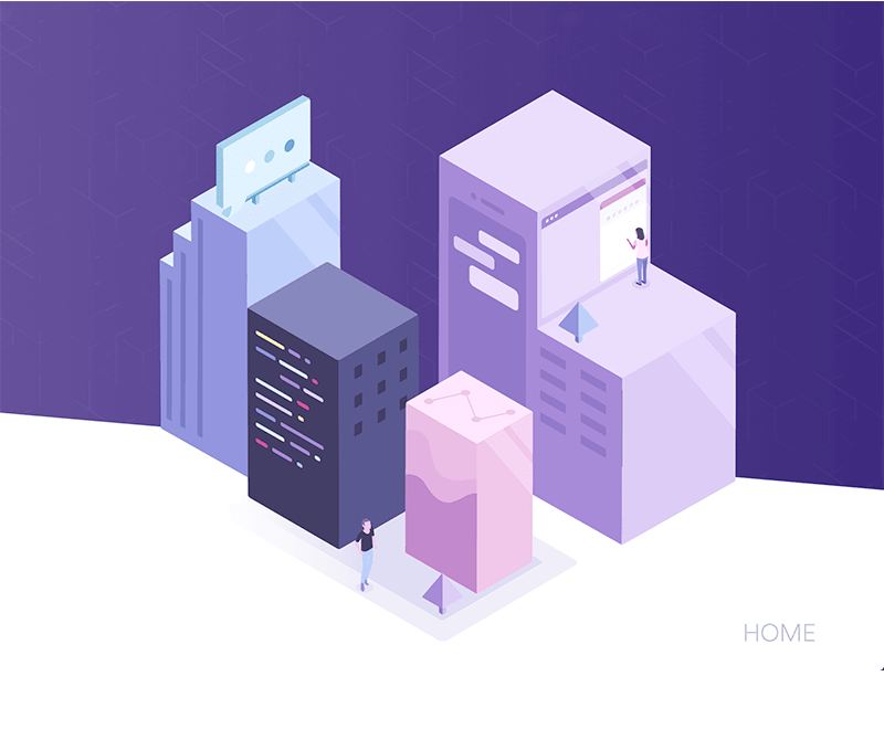
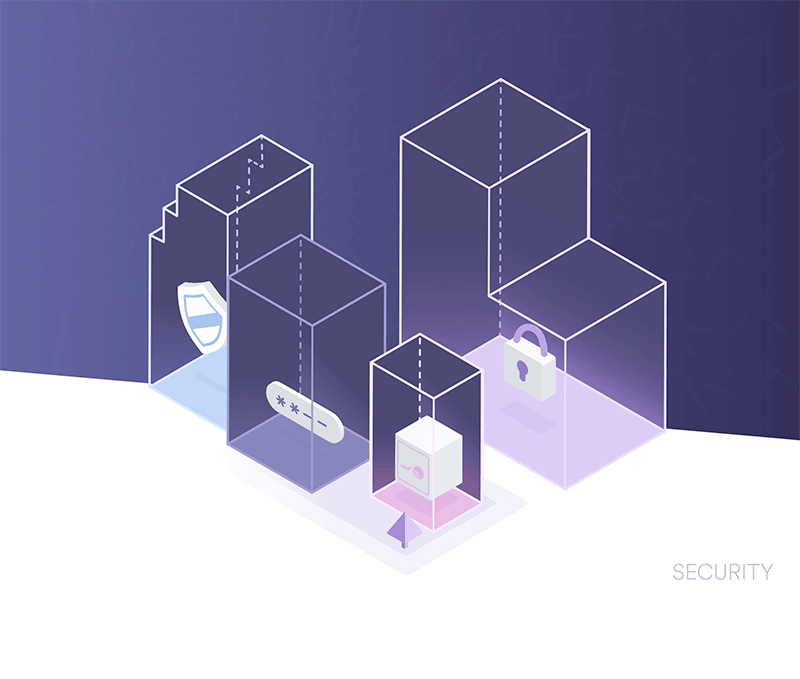
PRODUCT ILLUSTRATIONS
MORE ILLUSTRATIONS