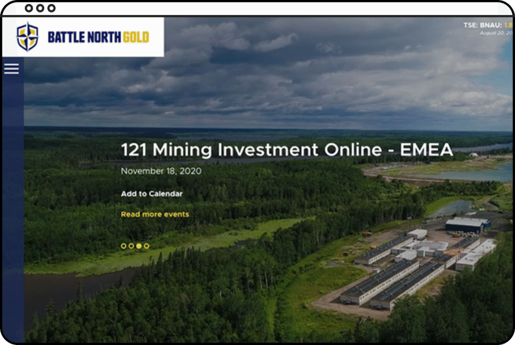
Battle North Gold
Bateman Gold Project rebranded as Battle North Gold and needed a new website reflecting the new brand.
client
Penda Productions
Design tools
Sketch,
Adobe Creative Suite
Role
Web Designer
type
Responsive Website
Challenges
Organize information for pages with heavy text content.
Have pages with full-width header images with paralaxing sections and animating elements.
Responsibilities
Design two concepts.
Communicate with developers pointing out where animation would be and showing examples.
Impact
Client had better engagement with potential investors navigating their website.
Concept Work
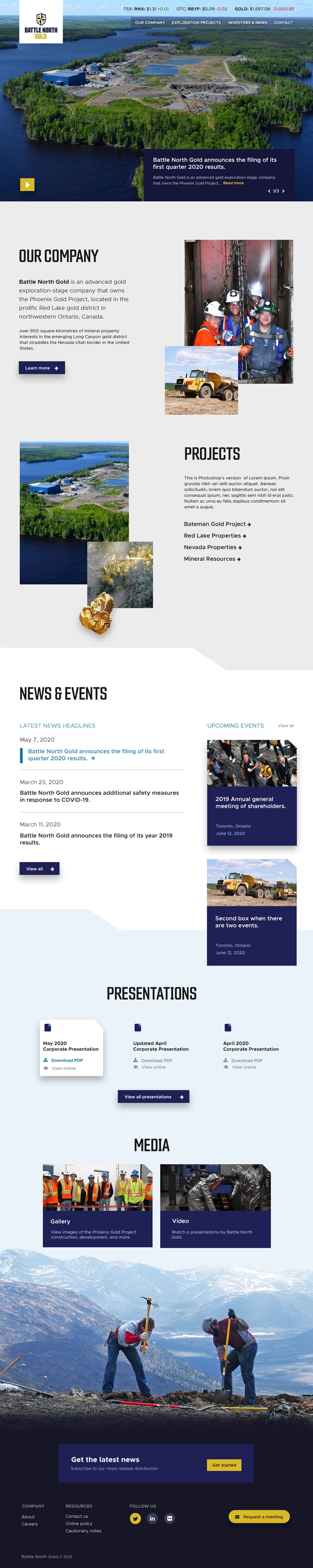
I designed the homepage and one internal page layouts using the images provided by the client. After showcasing two concepts, the client wanted a mix of both concepts. They liked the side navigation, smaller images for easier changes, and the clear divided sections.
Concept 1
In this concept, I wanted it to look geometric. I put a 45-degree corner on elements like the gallery boxes, icons, and upcoming events boxes. The sections have a geometric shape to look like they connect.
Concept 2
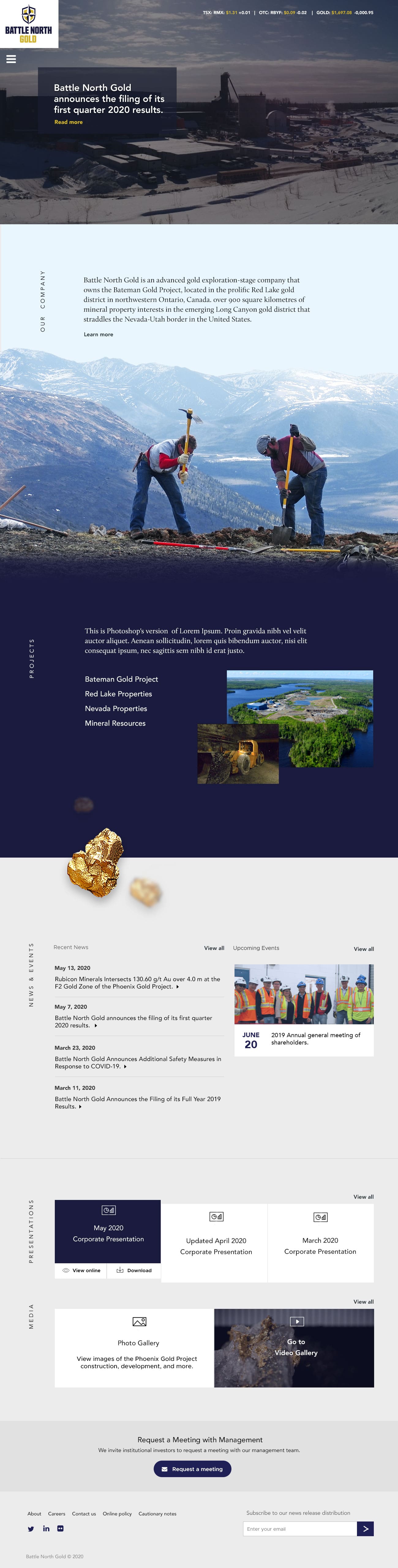
I played more with darker colors and full-width images in this concept. To tell the story of Battle North Gold, I wanted the sections to smoothly parallax into each other. To contrast the large imagery at the top, I made the News & Events and Media sections have minimal color and photograph.
final Design
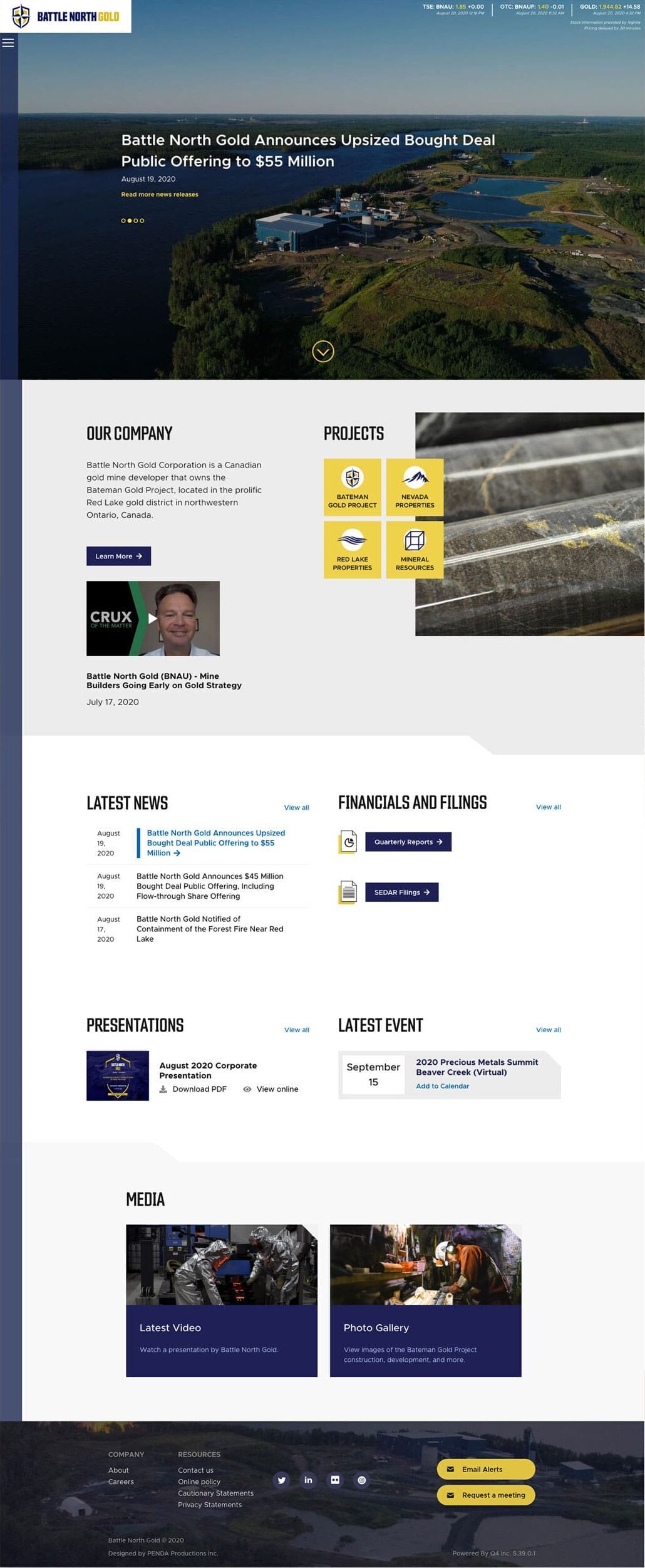
Homepage
After receiving client feedback, the final design is simplified. The layout for Company and Projects changed so that they are now side-by-side. Instead of text links for Projects, they are now replaced with yellow buttons with icons. To enhance visual interest, the large image on the right will change when the user hovers over a Project button.
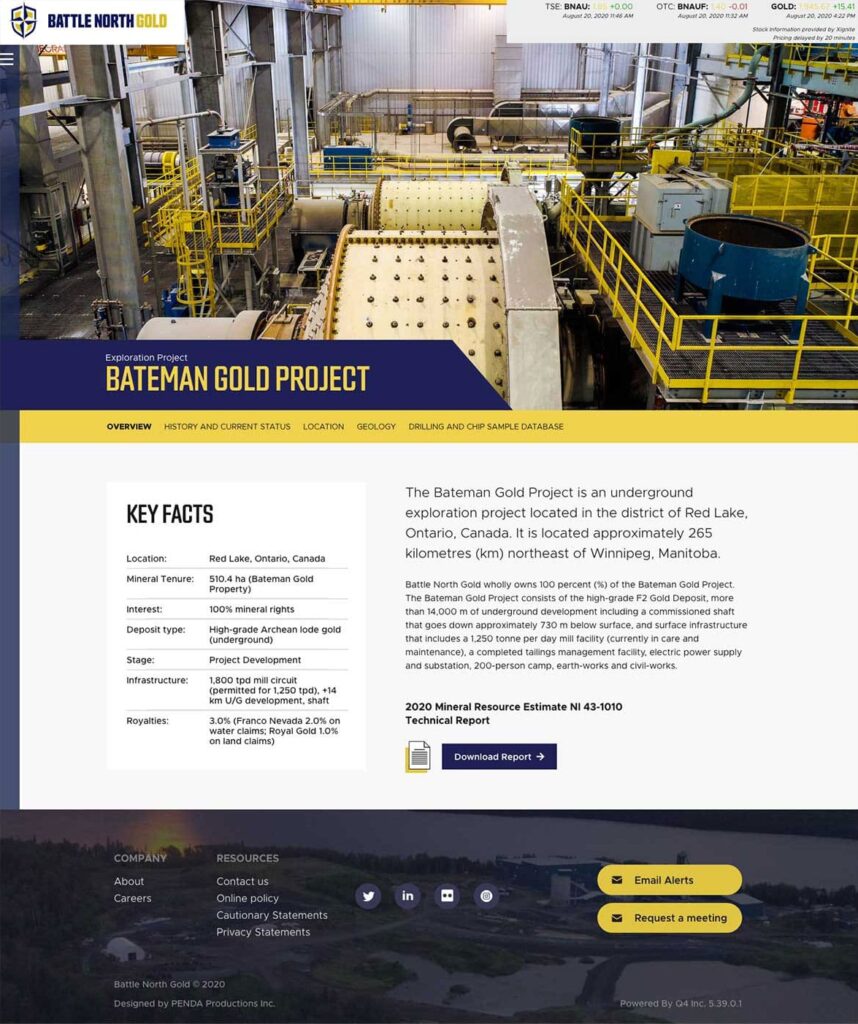
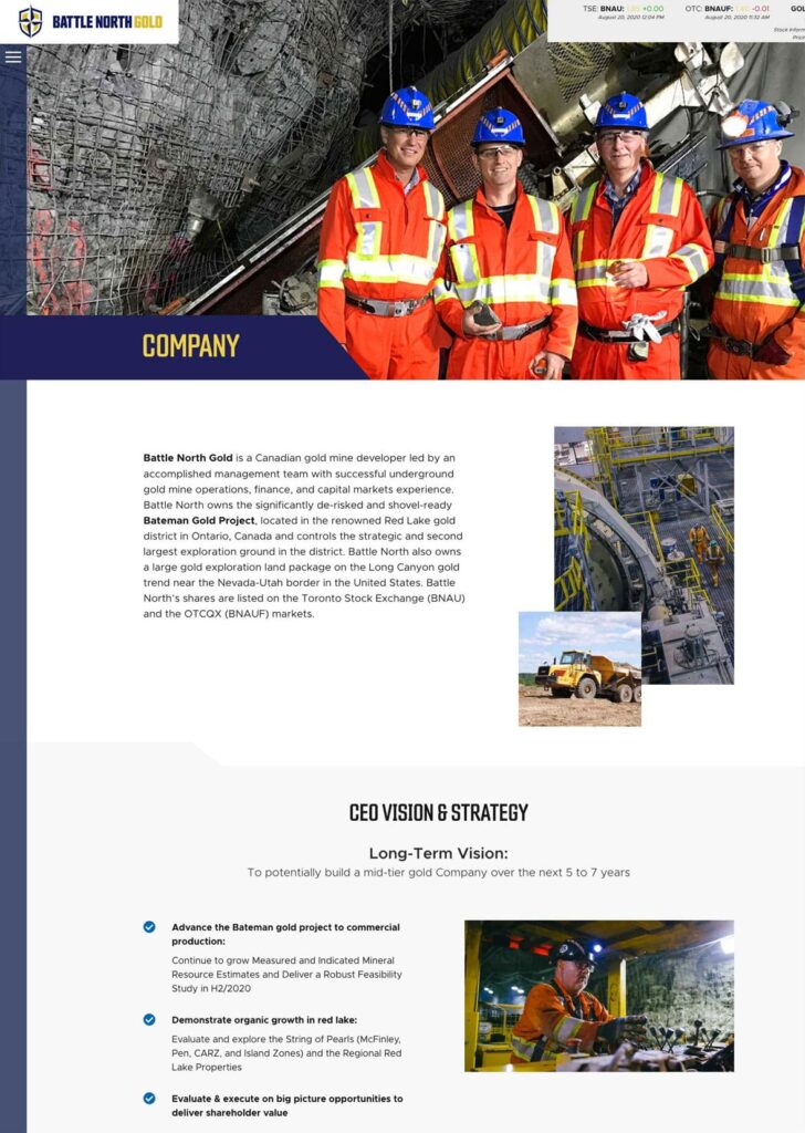
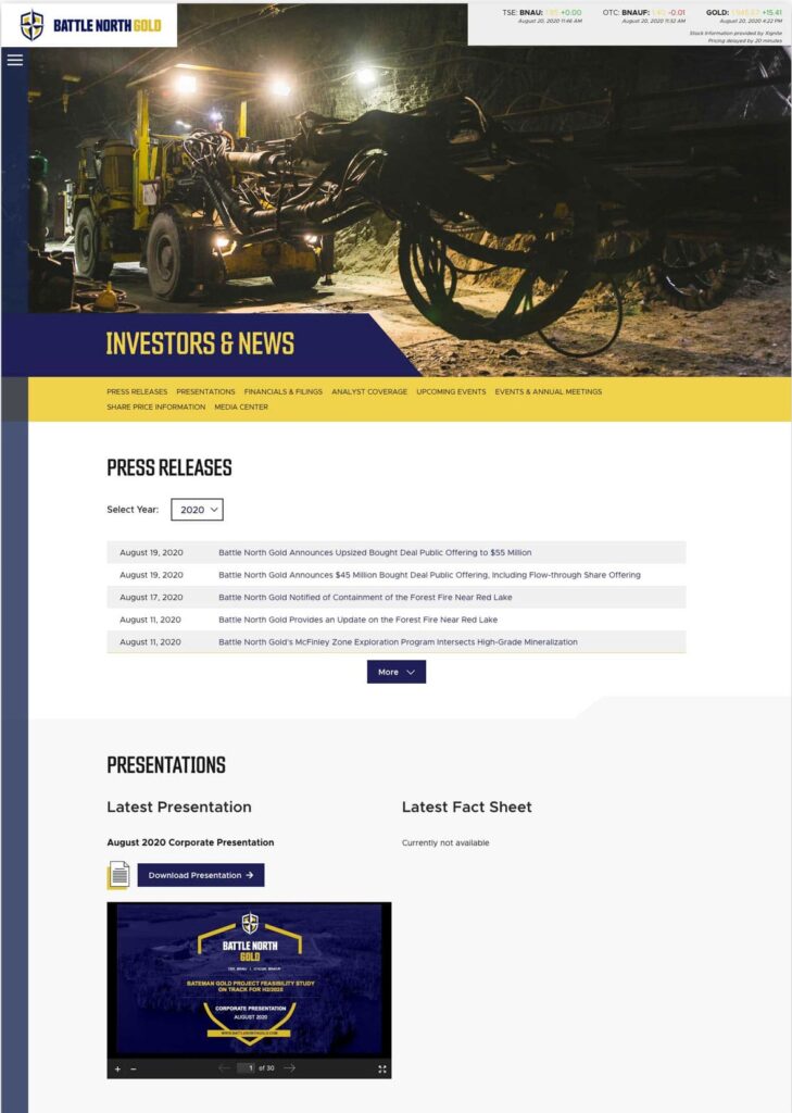
Internal Pages